Turning a dense dashboard into a clearer view of the game.
Bringing product design and visual hierarchy to sports analytics dashboards for ESPN and MLB in Google Looker.
- My role
- Senior UX/UI Designer
- Focus
- Dashboards · Visual systems
- Discipline
- Product design · Data visualization
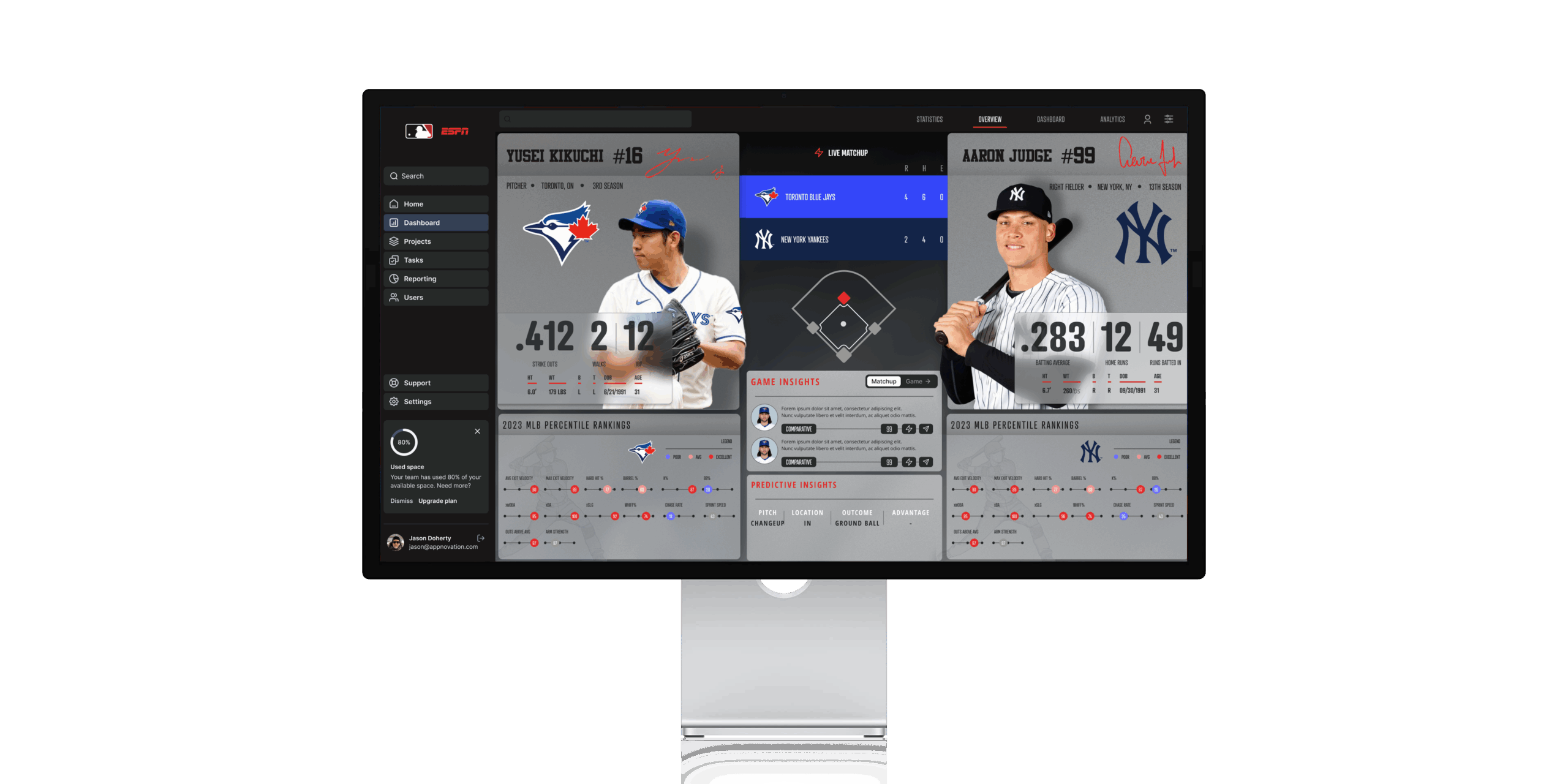
Select the image to view at full size. Selected design work for ESPN / MLB · Google Looker.
The challenge
A dashboard can contain the right information and still make it difficult to find an answer. This work focused on making dense sports data easier to scan and interpret, with a visual structure that could serve different stakeholder needs.
My contribution
I worked on the dashboard experience and data visualization design: reviewing the information hierarchy, shaping layouts, and developing a visual system aligned with the brands and the data being presented.
Design approach
Give the information a hierarchy
I reviewed existing dashboards for cognitive load and readability, then organized the interface into clearer groups so users could move from a broad view to more specific information.
Keep visual language consistent
Typography, colour, chart treatment, and layout needed to work together. I developed a coherent interface system to help users understand relationships without relearning the page.
Consider different viewing contexts
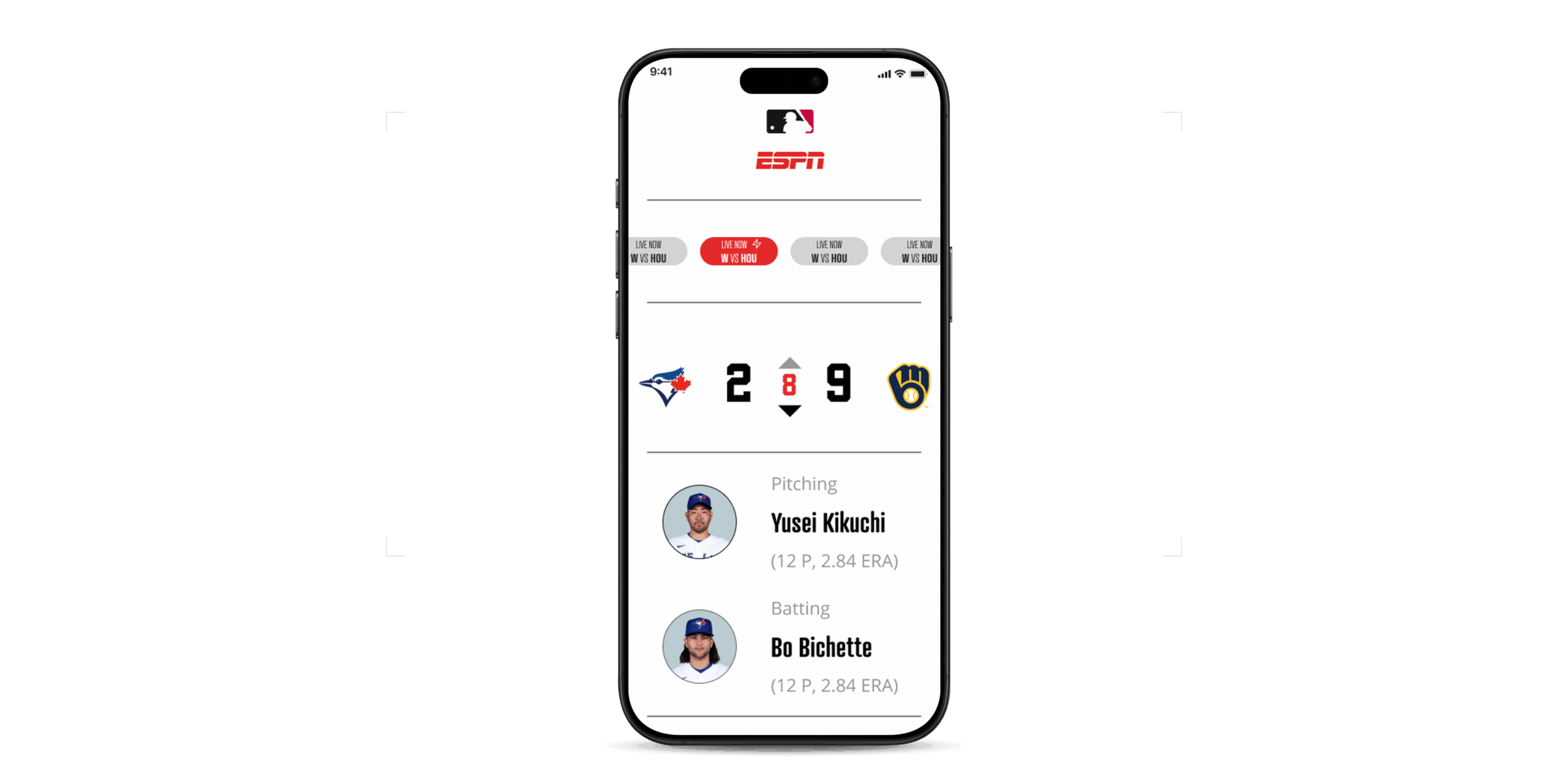
Desktop presentations and smaller screens place different demands on a dashboard. I explored responsive layouts and interaction patterns that kept the key information accessible across formats.
What I delivered
The work produced dashboard designs, a consistent visual treatment for analytics, and responsive interface explorations. Design documentation supported collaboration with stakeholders and the teams working with the underlying data.
The design lesson
The value of a data interface comes from how well it supports interpretation. Visual polish works best when it follows a clear information hierarchy.
Complex product.
Clearer experience.
I’m exploring Senior and Staff Product Designer opportunities with teams building useful, ambitious products.
Let’s talk about your team