I make complexproducts feel clear.
20+ years designing for government, finance, enterprise software and global brands. I lead teams and still do the hands-on work.
Illustration: tangled lines on the left (research, where things are uncertain) gradually align in the middle (concept, where patterns emerge) and resolve into one clear line on the right (design, where things become clear).
01 / Selected work
Case studies
Five recent projects.
A systems thinker.
A hands-on designer.
I care about the small details and the big systems behind them.
Agencies, games, enterprise and government. Outside work: illustration, basketball coaching, books and a house full of cats.
Find the right problem
Research and service mapping, before any pixels.
Make complexity usable
Clear flows, accessible interfaces, solid design systems.
Bring the team with you
Prototypes and clear rationale that keep everyone moving.
Selected work
Five recent case studies.
Past projects
Earlier agency, brand and game work.
Play
Miscellaneous ideas and experiments: image-making, texture, type and photography, outside of client work.
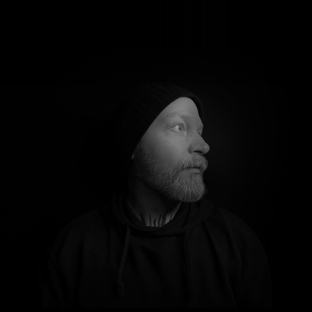
I’m Jason Doherty.
Principal Product Designer & UX Lead · Ottawa, Canada
Who I am
I’m a product designer and UX lead in Ottawa, with 20+ years in government, finance, enterprise and brand work.
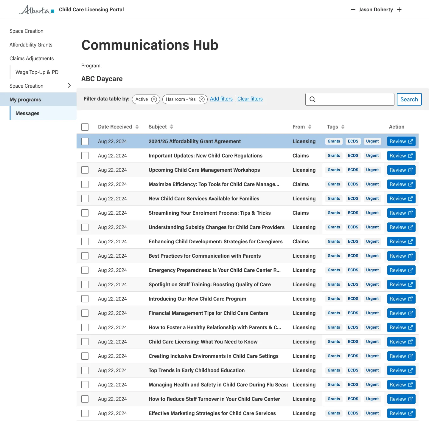
Lately: open banking for FCAC, child care for Alberta, vessel registration for Transport Canada, and MLB dashboards in Google Looker. Before that, Nike, Jordan Brand and video games.
I take on full-time roles and contract work, and I hold Secret clearance.
What I do
I turn complex services and data into products people can actually use.
Service design
Mapping whole services, so every screen fits the bigger journey.
Design systems
Components and standards that scale, including work with the GC Design System team.
Accessibility
WCAG 2.1 AA from the start, not patched in at the end.
Data and dashboards
Making dense numbers easy to read, from baseball stats to security status.
Research and prototyping
Interviews, testing and fast prototypes with real data, often AI-assisted.
Design leadership
Leading designers and developers, and presenting to directors and ministers.
How I do it
From uncertainty to clarity, every time.
Research Uncertainty
Talk to people, learn the constraints, look at what exists.
Concept Patterns / Insights
Map it, find the patterns, prototype early.
Design Clarity
Flows, interfaces and systems, accessible from the start.
Delivery
Work alongside engineering so what ships matches the design.
Where I’ve worked
Three chapters, one thread: making complex things simple.
Agency
Digital design for global brands, where detail had to earn attention.
Video games
UI and UX for AAA games, making dense systems readable fast.
Public sector
UX leadership for government services, where policy meets people.
Recognition
Recommendations
Elsewhere
LinkedIn · Email · Download CV (PDF, 2026)
Outside design: illustration, basketball coaching, books and a house full of cats.
Make complex products feel clear.
A few of the teams I’ve worked with.
- Government of Canada
- Government of Alberta
- Transport Canada
- Microsoft
- IBM
- Salesforce
- Cisco
- Intel
- NVIDIA
- Samsung
- Disney
- Electronic Arts
- Jordan Brand
- Mercedes-Benz
- Coca-Cola
- HP
- Piranha Games
- Dell
- Telus
- MEC
- Tweed
- Air Jordan
- CBC
- Honda
- Jeep
- McDonald’s
- General Motors
- Motorola
- Martha Stewart Living
- Cadillac
- Blue Cross
- BC Hydro
- LG
- Central 1
- 1-800-GOT-JUNK?
- Government of British Columbia
- City of Vancouver
- Canopy Growth
- Looker
- MetLife
- University of British Columbia
- TCL
- AstraZeneca
- Sugoi
- VMware
- Rogers
- Pfizer
- Appnovation
- Dodge
- Dogwood Initiative
- Kivuto
- Noise
- Total
Let’s talk
Tell me aboutyour team.
hello@jasondoherty.comHire me
Full-time product design, UX lead and design manager roles.
Work with me
Contract and consulting: design systems, accessibility reviews, service design and UX strategy. Incorporated, insured, with Secret clearance.
What to include
A few lines about the product and team. A link to the role helps. My current CV is ready to download (PDF, 2026).
Where I am
Ottawa, working remotely across Canada.
Case study 01
From rough wireframes to a scalable, accessible open banking portal.
Turning rough wireframes into an accessible, consistent portal for a federal service.
Senior UX Consultant · UX design lead
Interaction architecture · RBAC · Design system
Reusable templates, a clear roles model and an accessible foundation, with senior stakeholders on board.
The challenge
Open banking launches in Canada in 2027, and FCAC oversees it. The portal started as rough, inconsistent wireframes. Sign-in, roles and navigation had to work for several kinds of users and meet Government of Canada standards.
My contribution
I set the UX direction and treated the portal as one connected service, not a stack of screens. I mapped the service end to end and turned the concepts into reusable page templates.
Before and after
Design approach
Templates, not one-offs
Consistent layouts and patterns, so every new screen is quicker to build.
Simpler sign-in and access
Fewer steps for each user to reach what applies to them.
A clear roles model
Which roles exist, what each can see and do, and how that shows up on screen.
Accessible from the start
WCAG 2.1 AA built into the patterns, not patched in at the end.
Built on the GC Design System
I worked with its team, and my feedback improved components used across federal services.
Fast, realistic prototypes
Figma Make connected to live data, so we could test with real users quickly.
Extras I proposed
Five improvements beyond the brief, presented to FCAC and the Bank of Canada.
Multi-file uploader
Add every document at once. Test users strongly preferred it.
User-first structure
Reorganized an engineer’s API checklist around what people are trying to do.
A familiar federal look
With scams on the rise, looking like trusted Canada.ca sites builds confidence.
Search and filters
Find information by browsing, not by remembering exact terms.
More room for content
Navigation moved into a flyout, and next steps kept in one place.
Outcomes
A foundation to build on
Templates and patterns instead of one-off screens.
Simpler key journeys
Fewer steps in sign-in and access.
Everyone aligned
Senior stakeholders backed the direction.
01From early wireframes to finished screens
Early wireframes beside the designs that replaced them.
02Portal home and landing pages
Landing page directions and three home screens.
03Dashboards, reporting and audit
Views for administrators and compliance teams.
04Logo upload flow
Upload a logo in four steps: requirements, guidelines, upload, review.
05Support and accessibility
Getting help, and adjusting the portal for accessibility needs.
The takeaway
Design the system first, and every screen after it gets easier.