I make complexproducts feel clear.
20+ years shaping digital experiences across enterprise, government, and global brands. Research, systems thinking, and hands-on design—from the first question to the final interaction.
Open to Senior and Staff Product Design roles · Ottawa, Canada
01 / Selected work
Clarity, in practice.
Five projects at the intersection of people, systems, and complex decisions.
A systems thinker.
A hands-on designer.
I connect the details people interact with to the systems and teams behind them.
My career spans agencies, enterprise products, public services, and games. I’ve led designers and researchers, worked alongside product and engineering teams, and stayed close to the craft: flows, prototypes, interaction design, and the details that make a product usable.
Outside design: illustration, basketball coaching, books, and a house with plenty of cats.
Find the right problem
Research, workshops, and service mapping to understand user needs and the constraints shaping the product.
Make complexity usable
Clear workflows, accessible interfaces, and design systems that bring consistency to complex products.
Bring the team with you
Prototypes, design rationale, and delivery documentation that help product, engineering, and stakeholders move forward together.
Complex product.
Clearer experience.
I’m exploring Senior and Staff Product Designer opportunities with teams building useful, ambitious products.
Let’s talk about your teamSelected work
Five projects at the intersection of people, systems, and complex decisions.
Product design forthings that have to work.
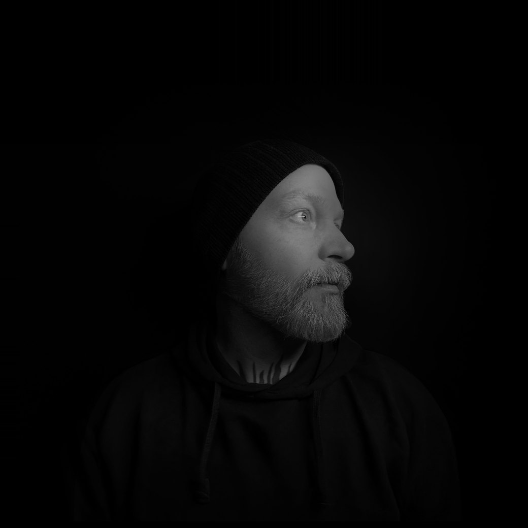
I’m a senior product designer and UX lead based in Ottawa, Canada, with more than 20 years of experience across enterprise products, public services, and global brands.
My work today focuses on complex, high-stakes products: government services, regulated platforms, data tools, and enterprise software. I’ve led UX for organizations including Government of Alberta, Transport Canada, Treasury Board Secretariat, FCAC, and ESPN / MLB on Google Looker.
Earlier in my career I worked in brand and digital campaigns for Nike, Jordan Brand, HP, and Mercedes-Benz, and in games. That background still shapes how I think about craft, motion, and detail.
I connect the details people interact with to the systems and teams behind them. I’ve led designers and researchers, worked alongside product and engineering teams, and stayed close to the craft: flows, prototypes, interaction design, and the details that make a product usable.
I start with the people and the policy or business constraint behind a product, map the service end to end, then prototype early and test with real users. I build accessibility in from the start (WCAG 2.1 AA), keep design systems consistent across teams, and work closely with developers through sprint standards and clear definitions of done.
Illustration, basketball coaching, books, and a house with plenty of cats.
Complex product.
Clearer experience.
I’m exploring Senior and Staff Product Designer opportunities with teams building useful, ambitious products.
Let’s talk about your teamLet’s talk
Tell me aboutyour team.
hello@jasondoherty.comWhat I’m looking for
Senior and Staff Product Designer roles with teams building useful, ambitious products.
What to include
A short note on the product, the team, and where design fits in. A link to the role helps. A short CV is available to download, and a full résumé is available on request.
Where I am
Ottawa, Canada.
Turning a dense dashboard into a clearer view of the game.
Bringing product design and visual hierarchy to sports analytics dashboards for ESPN and MLB in Google Looker.
Senior UX/UI Designer
Dashboards · Visual systems
Product design · Data visualization
Delivered the dashboard designs and visual system as design artifacts for the client team to build. My involvement ended at delivery.
The challenge
A dashboard can contain the right information and still make it difficult to find an answer. This work focused on making dense sports data easier to scan and interpret, with a visual structure that could serve different stakeholder needs.
My contribution
I worked on the dashboard experience and data visualization design: reviewing the information hierarchy, shaping layouts, and developing a visual system aligned with the brands and the data being presented.
Impact
A clearer, more consistent set of dashboards for players, matchups and league-wide views, making dense sports data easier to scan for different stakeholders.
Design approach
Give the information a hierarchy
I reviewed existing dashboards for cognitive load and readability, then organized the interface into clearer groups so users could move from a broad view to more specific information.
Keep visual language consistent
Typography, colour, chart treatment, and layout needed to work together. I developed a coherent interface system to help users understand relationships without relearning the page.
Consider different viewing contexts
Desktop presentations and smaller screens place different demands on a dashboard. I explored responsive layouts and interaction patterns that kept the key information accessible across formats.
01Player dashboards
Player-level views that bring a profile, key stats and charts together, from a fixed overview to a dashboard of tiles the user arranges.
02Live matchup and batting
Comparing two players during a game, and exploring where a player’s hits land.
03League and global views
League-wide views of where venues are and where players come from, with filters for team and date.
What I delivered
The work produced dashboard designs, a consistent visual treatment for analytics, and responsive interface explorations. Design documentation supported collaboration with stakeholders and the teams working with the underlying data.
The design lesson
The value of a data interface comes from how well it supports interpretation. Visual polish works best when it follows a clear information hierarchy.